If you've been following the Yukon Quest for awhile you may remember that 2011 was pretty harrowing, with some bad weather in the middle and second half of the race that caused some very serious problems for those in the front of the pack. Brent Sass recorded some particularly memorable video as he helped a nearly-hypothermic Hans Gatt off American Summit:
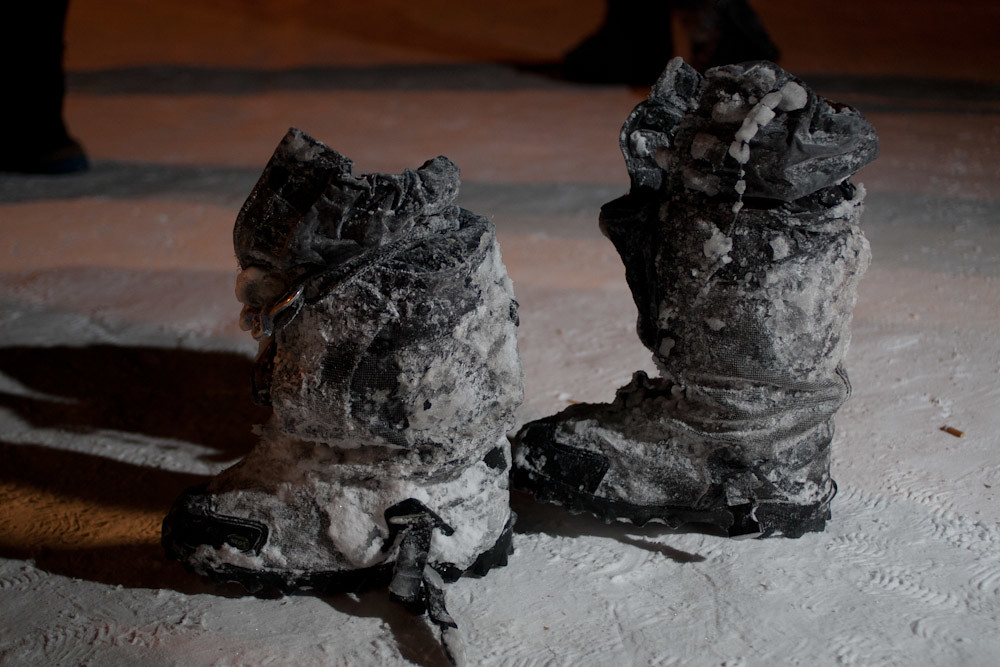
and Sebastian Schnuelle's ice-caked boots in Central told a story, as well:
What I did with the 2011 data was virtually identical to what I did with the 2013 data: For each checkpoint I took a look at runtimes to get a general picture of what happened on that leg of the race. Then I collected those runtimes into a table, where I ran correlations of runtimes for each race segment against the finishing position.
The unsurprising part was that race segment distance correlated quite well with overall finishing position, with the longest race segment (Dawson to Eagle) showing a very, very large positive correlation with finishing position, at .8537. So again, this year look for longer race segments to have greater predictive value for finishing position.
The surprising bit, at least initially, was that there were four checkpoints at which runtime was inversely correlated with finishing position (in one case, strongly so). They were Slavens (-0.1755), Circle (-0.4027), Central (-0.2543), and 101 (-0.0877). At well over half-way into the race, the faster teams had pulled up towards the front, and this is where they ran into awful conditions, which slowed them down. By the time the back of the pack arrived the overflow had frozen and the weather had moderated. So, they were able to travel faster.
Nevertheless, the correlated between traveling speed over longer segments and overall finishing position remained reasonably strong, with an r value of 0.4527. Here's the plot:

If you're interested in looking at the data and playing with them yourself, they're here, with the correlations on the very last sheet. Unfortunately Trackleaders hadn't added the replay feature to their tracker at that point, but the race track is online here and looking at individual musher pages can help illustrate some of what happened (the closer together the breadcrumbs, the slower the team was moving [assuming that the breadcrumbs were being uploaded at regular intervals]).
Also, note that this analysis lacks anything resembling rigor, including questionable choice of metrics for correlation, etc. But, for a casual description of how the race played out and how that's reflected in the race statistics, I think it's adequate. Let me know if you spot a problem, or if you've got further questions.